


Catching the eye of an abortion-minded woman can be done through a design that stands out through the clutter. When it comes to young women, visuals can make or break your online marketing efforts. And, when we say visuals, we aren’t just talking about the photos you use. We mean ALL the visual components that go into your marketing – whether that is spacing, the color scheme, typography, or visual hierarchy on your web pages. Through this design cheat sheet, we will be sharing some of the best tricks, tools, and practices that will get young women to stop and notice your organization.
Spacing
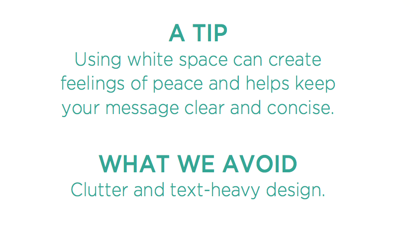
The right amount of space can create balance and harmony, while communicating the feeling you wish to evoke on your audience. When white space isn’t used correctly, your design will look cluttered, which affects readability and user experience. Below are two pointers to help your organization that utilize spacing.
Colors
Color Psychology is a theory on how different colors can affect one’s emotions, thoughts and actions. Many organizations take color psychology into consideration when planning their visual marketing strategy. Below are some of the feelings associated with each color.
- Purple – Charming
- Blue – Trusting
- Orange – Warmth
- Gray – Neutrality
- Pink – Hopeful
- Red – Passion
- Green – Restoration
- Yellow – Optimism
Colors We Love: Blues, combined with softer warm tones, such as pink and peach, inspire hope and trust.
Typography
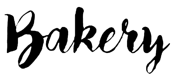
Limit yourself to two or three fonts and keep them consistent to reinforce branding. Make sure the fonts you choose are easy to read and complement each other well. For example, Bakery, a handwritten script font, pairs well with a straight, clean san-serif font like Gotham Light.
![]() Interested in finding some new fonts for your marketing materials? Here are a few tools we love:
Interested in finding some new fonts for your marketing materials? Here are a few tools we love:
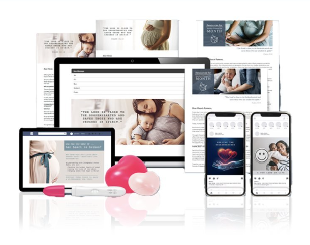
Imagery
Images That Inspire Us:


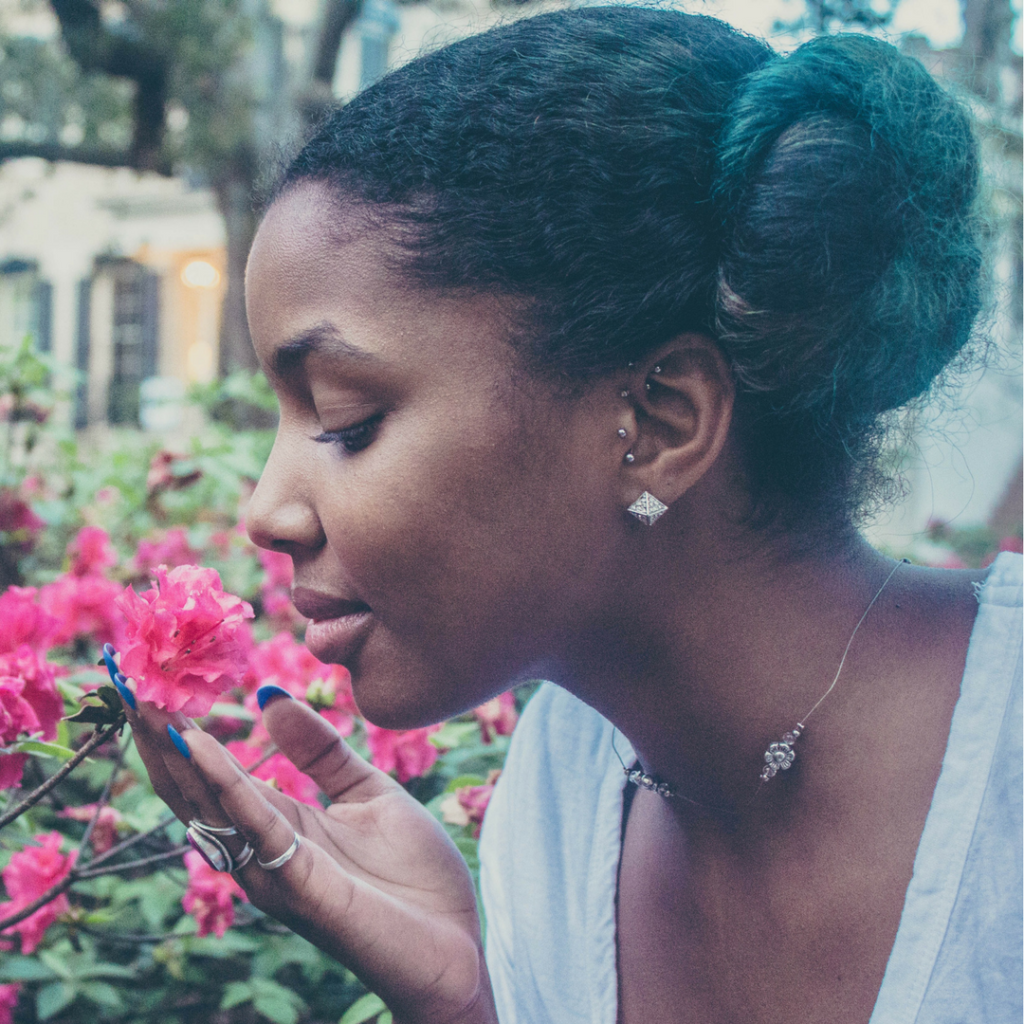
Choose images that reflect your demographic and embrace diversity. Look for images that are hopeful and bright. Avoid images that could make your audience feel sad or hopeless.
Check out pexels.com or unsplash.com for free images!
Hierarchy
Draw attention to the most important peeve of your design by utilizing size. Make sure no two elements are the same size, so they don’t compete with one another.
A Note: In this blog we have created hierarchy by making our headlines large and having our body text smaller. This allows for readability.
If you’re looking to expand your reach among abortion-minded women, or want to explore design possibilities even further, contact Choose Life Marketing today!