Web Design
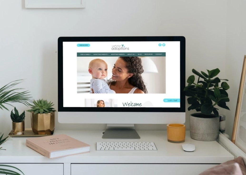
A Gift of Hope Adoptions is an adoption agency we rebranded and created a new website to help them appeal to and reach more birth moms. A trend we noticed across the adoption industry is a heavy emphasis on the adoptive family without a lot of intentionality being directed towards the birth mother. This emphasis came across in the design of logos and general communication and was something we wanted to take into consideration as we designed this client’s website.
Through focused calls to action and close attention paid to the user flows for both the birth mother and the adoptive family, our design and web development team worked hand in hand to create a warm, welcoming site that would accomplish the specific needs of A Gift of Hope Adoptions.
Branding
The original A Gift of Hope Adoptions logo hadn’t been updated since its original creation, so it felt dated and needed color updates. The work of the agency was being undermined by a logo that was not speaking to the target demographics of both adoptive parents and birth mothers. After research into the industry and multiple internal rounds of creation and revision, the client was presented with this symbolic update.
Our designers brought the oft seen triadic concept in adoption including the child, adoptive parents, and birth mother, represented through three butterflies, into the branding for an added layer of symbolism. The butterfly itself represents the transformation and metamorphosis of change that takes place through the process of adoption.


